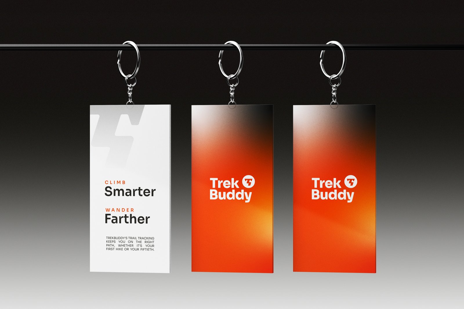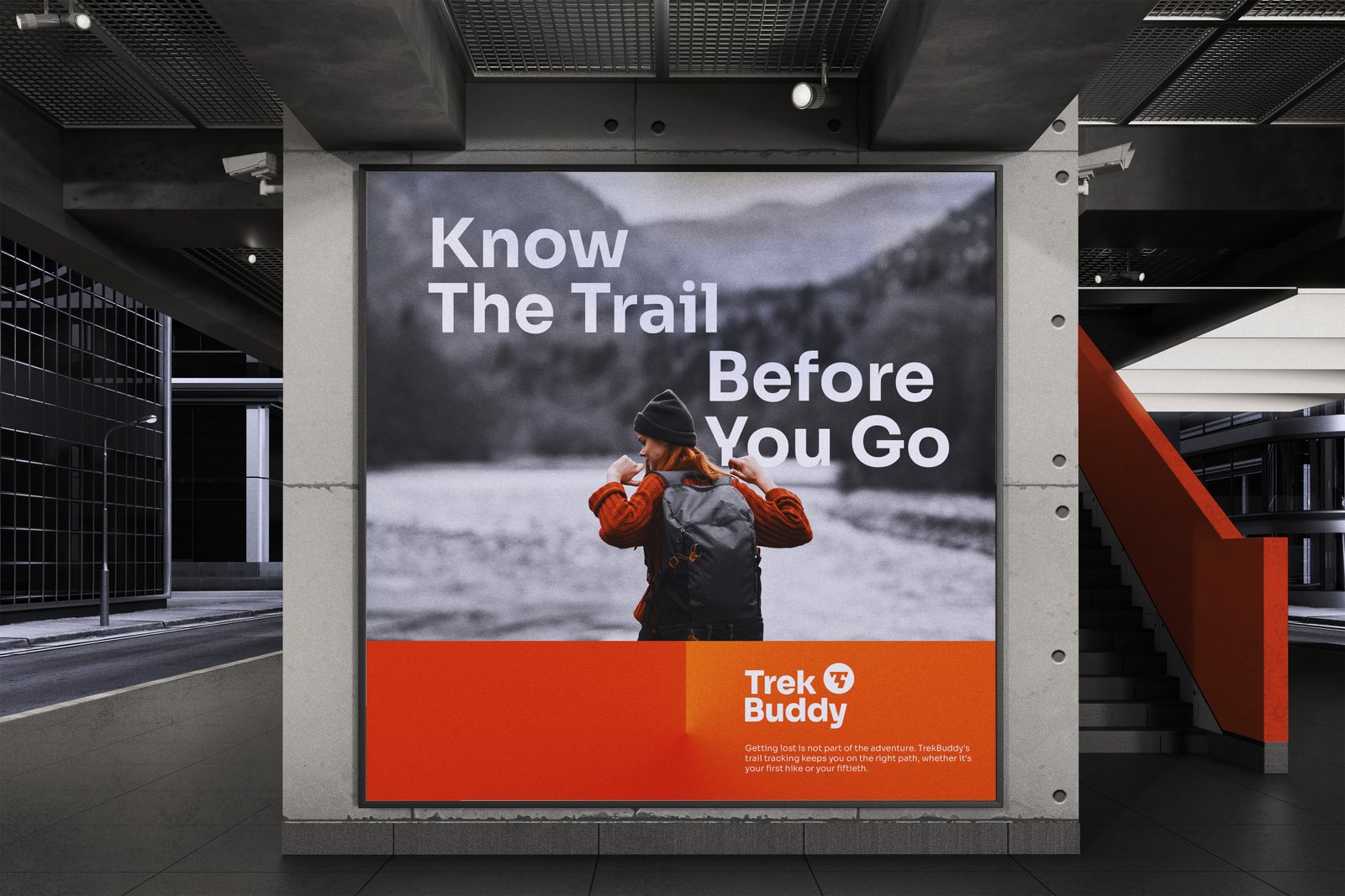
Turning a trail app into a mark that points every climber the right way up.
Project Overview
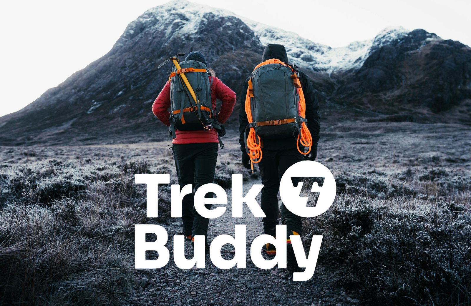
TrekBuddy is a mobile app built for mountain climbers and trekkers, tracking trails and pathways and surfacing up to date weather information so outdoor enthusiasts always know what they are walking into before they set out. I was brought in to build the brand identity around three ideas: adventure, safety, and reliable guidance, the same qualities the app promises the moment someone opens it before a climb.
What I delivered:
- Logo design
- Brand identity system
- Brand guideline
- Company profile design

Challenge
Outdoor and adventure brands lean hard on literal mountain silhouettes and compass needles, symbols so common they barely register anymore. TrekBuddy needed a mark that read as guidance and adventure without repeating the same visual shorthand every trekking app reaches for, while still feeling rugged enough to trust on a trail with patchy signal and changing weather.
- Adventurous, yet dependable
- Simple enough to read at a glance mid climb
- Distinct from the mountain and compass clichés every outdoor brand uses
Results
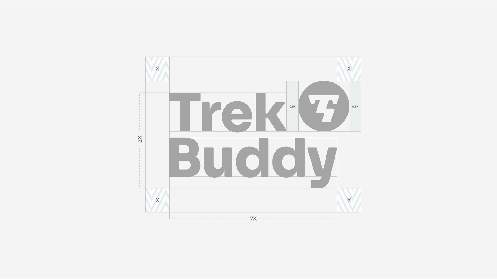
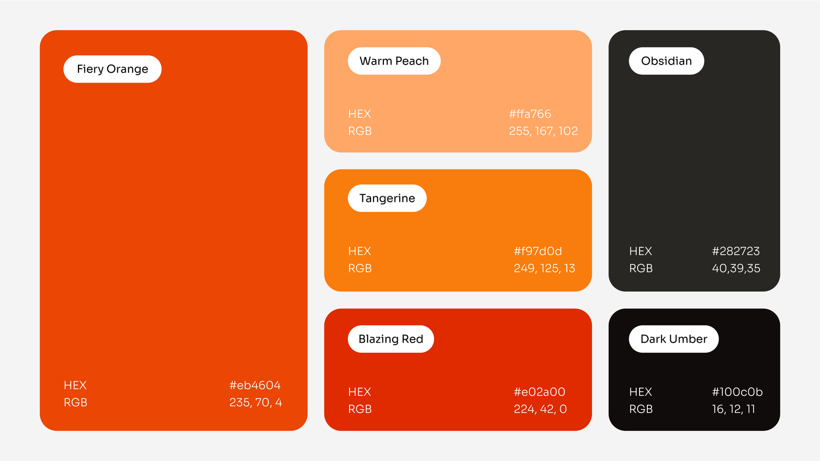
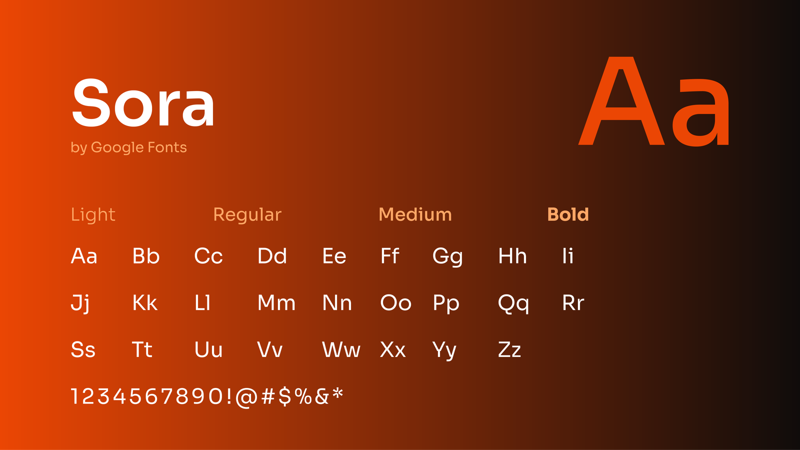
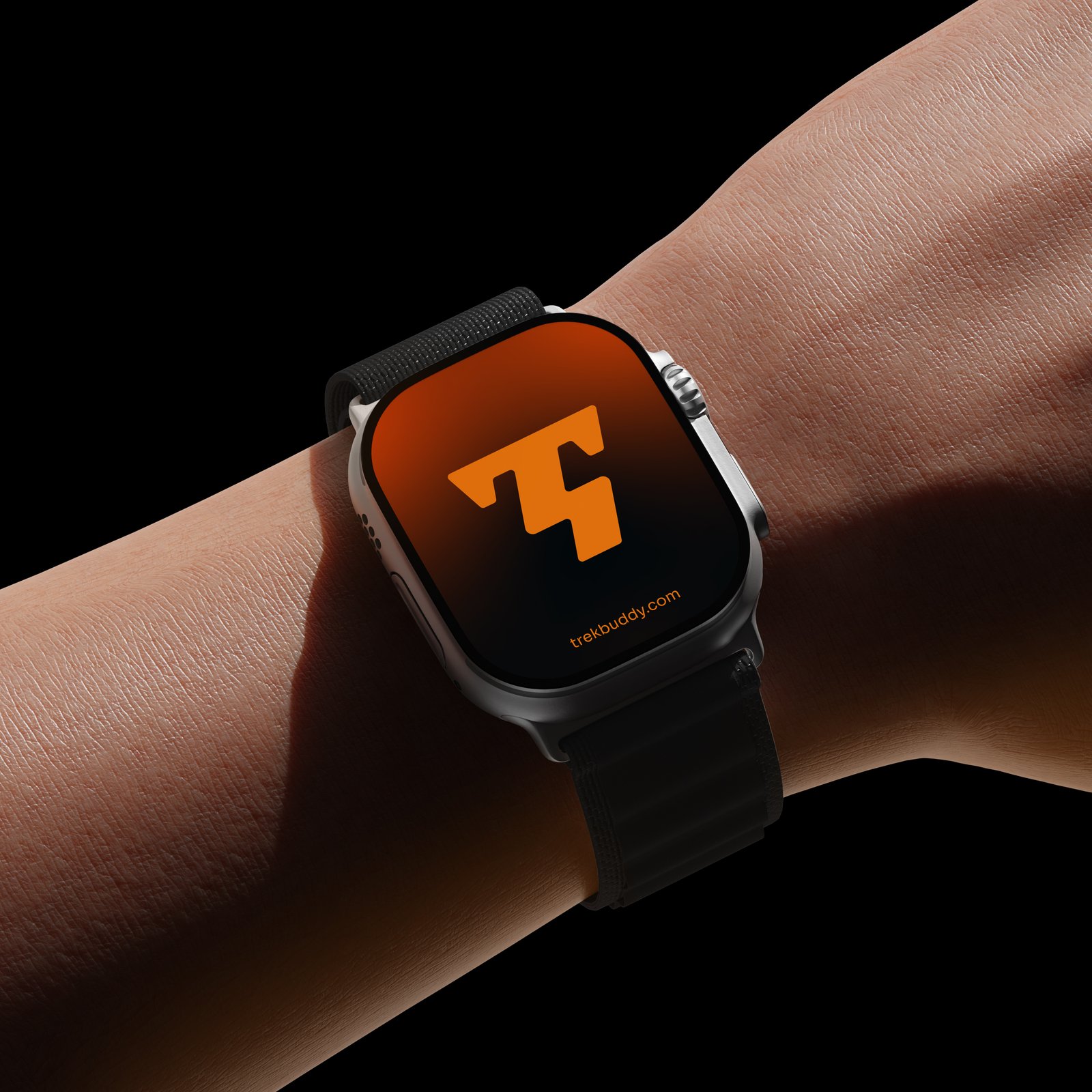
The answer was a logomark built from a stylized “T” that folds into a trail winding up a mountainside, so the brand’s own initial carries the app’s whole promise: a path, a guide, and a way up. Paired with a rugged yet clean type and color system, the identity feels adventurous without losing the clarity trekkers need when checking a route or a weather update mid climb.
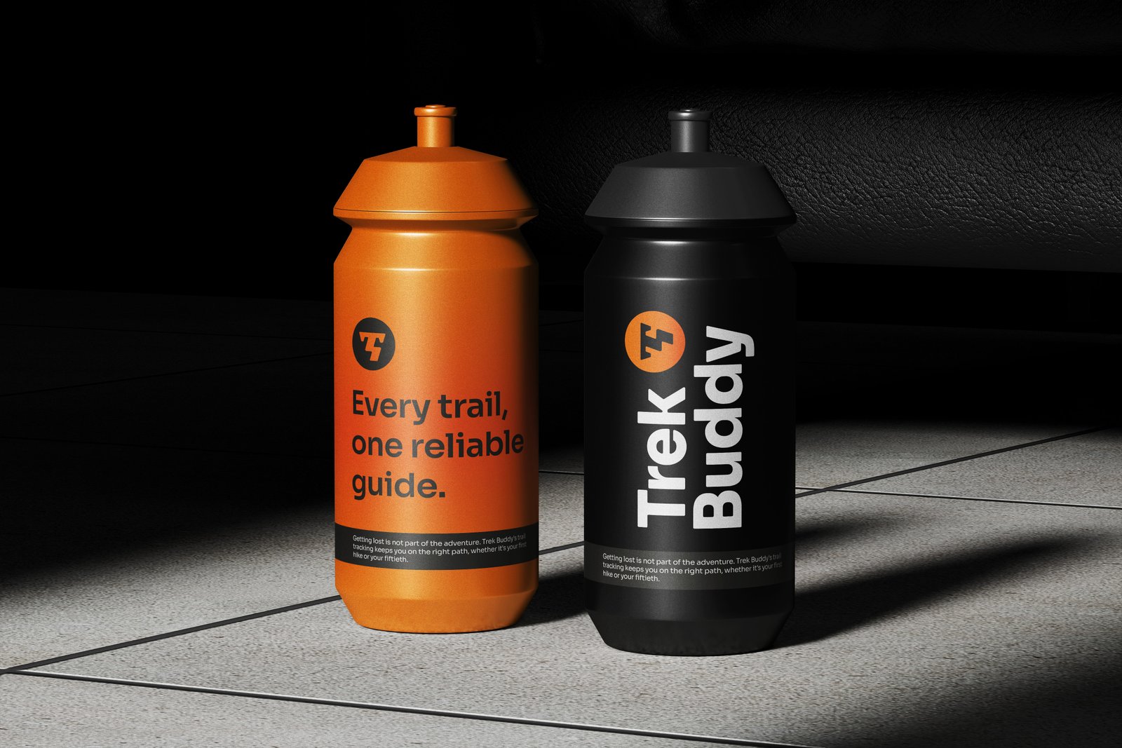
The mark holds its shape from a small app icon to trailhead signage, giving TrekBuddy one identity that feels as dependable as the guidance it promises every climber before they set out.