Giving a creative agency a mark that points every campaign in one clear direction.

Project Overview
arahtuju is a creative agency crafting campaigns through strategic storytelling, video production, photography, branding, and social media, working with clients across fintech, education, and hospitality. I was brought in to build the agency’s own identity from the ground up, the hardest kind of brief, since the audience judging this brand is every future client deciding whether to trust their story to arahtuju.
What I delivered:
- Logo design
- Brand identity system
- Brand guideline
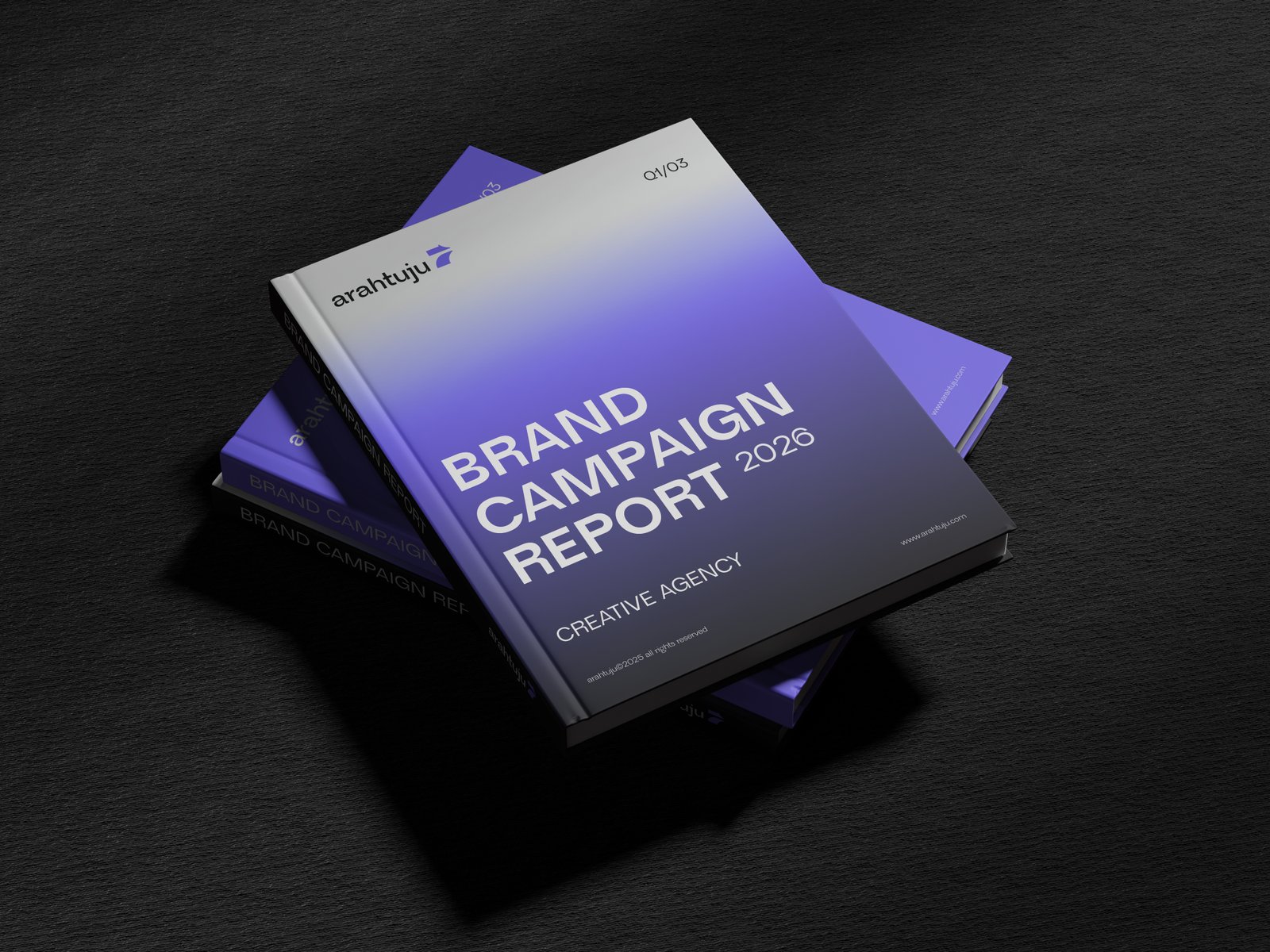
- Company profile design


Challenge
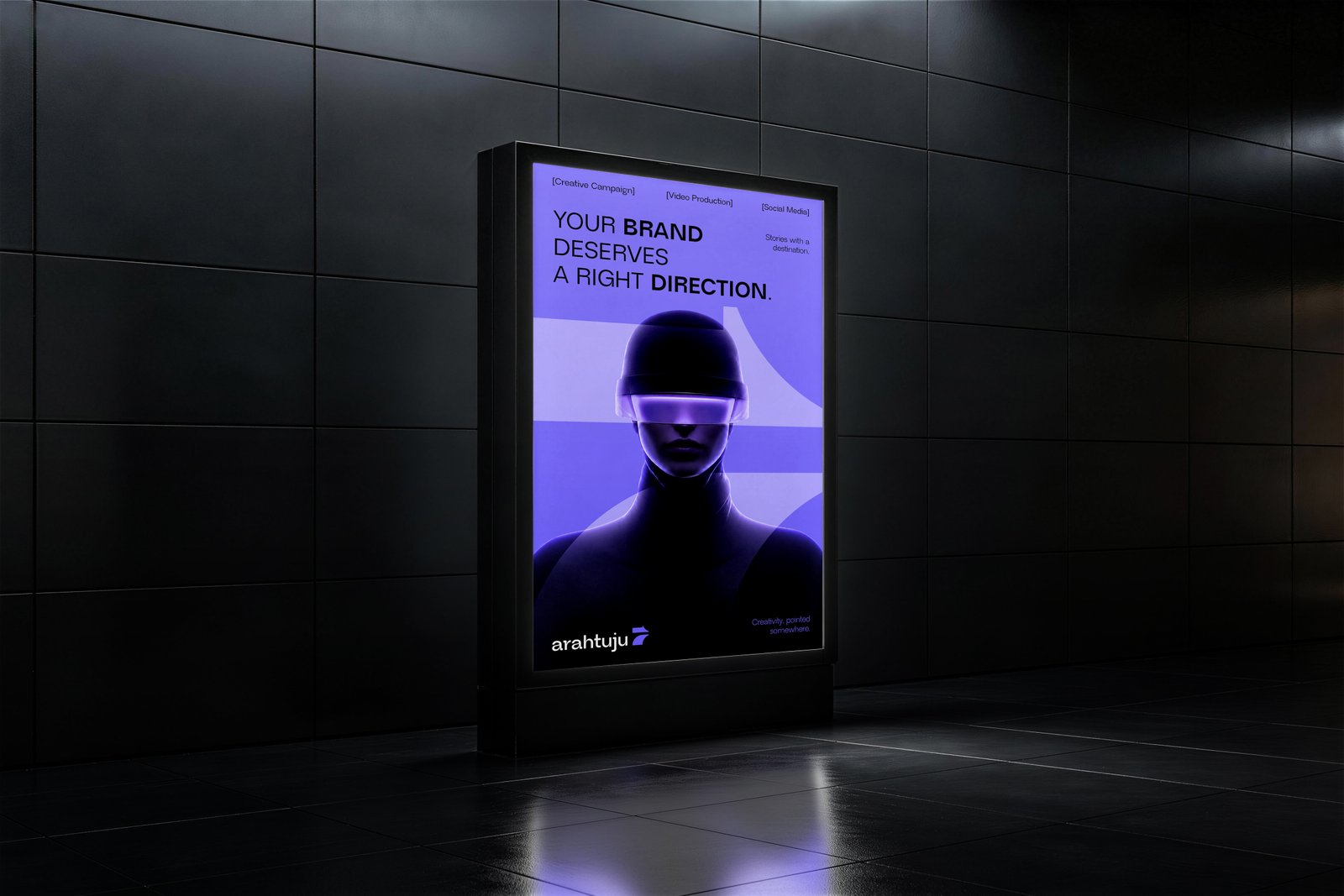
The name arahtuju comes from arah and tuju, direction and destination in Indonesian, which meant the identity had to embody guidance without falling into the obvious compass or arrow cliche every direction themed brand reaches for. It also had to work twice as hard as a normal client brand, since it needed to feel confident enough to sit next to fintech and university clients in a company profile, and energetic enough to survive on a dark, high contrast video thumbnail. The key tensions:
- A brand about giving direction, without a literal compass or map cliche
- Corporate enough for enterprise clients, energetic enough for creative ones
- One identity that has to work across video, decks, and a printed profile
Results
The mark folds three ideas into one shape. A bold arrow signals guidance and forward momentum, a sweeping curved path traces the day to day journey of directing a brand toward its goals, and the silhouette doubles as a numeral seven, a quiet nod to the phonetic echo between tuju and tujuh, seven, in the agency’s name.
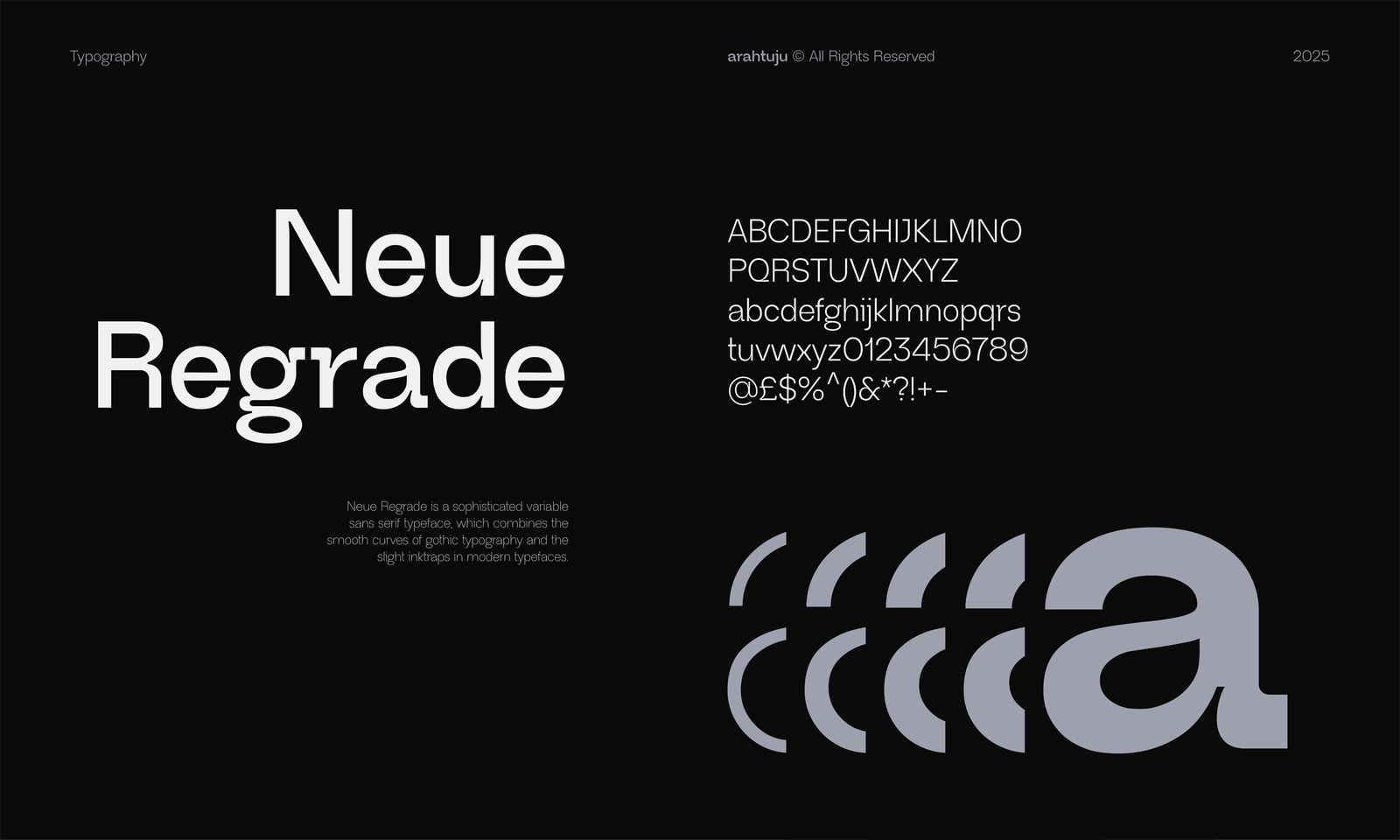
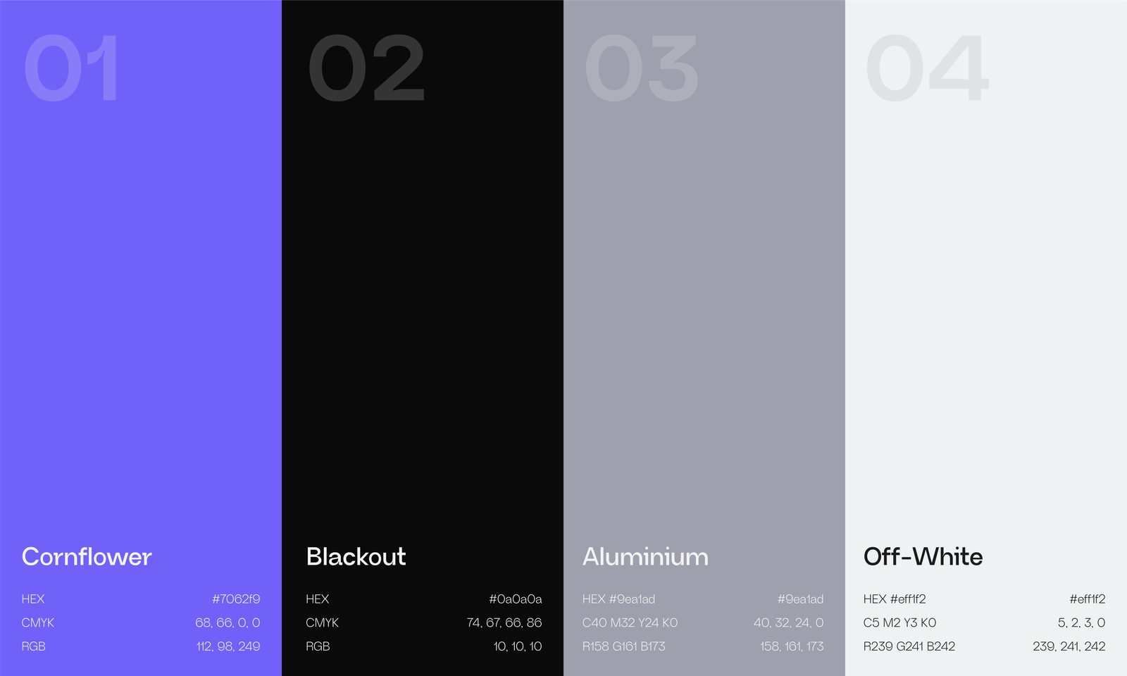
Cornflower purple carries the energy against a near black blackout background, while Neue Regrade’s gothic curves and inktraps give the wordmark a sophisticated, unmistakably studio made feel. The system holds its composure in high contrast video work and stays quiet and confident inside a printed company profile. The outcome is an identity that does exactly what the agency promises its clients, turning a scattered brief into one clear direction.