Forward Belgium

One identity to carry a century of logistics, always pointing forward.

Featured Image

Client

FORWARD Belgium

Year

2019

Services

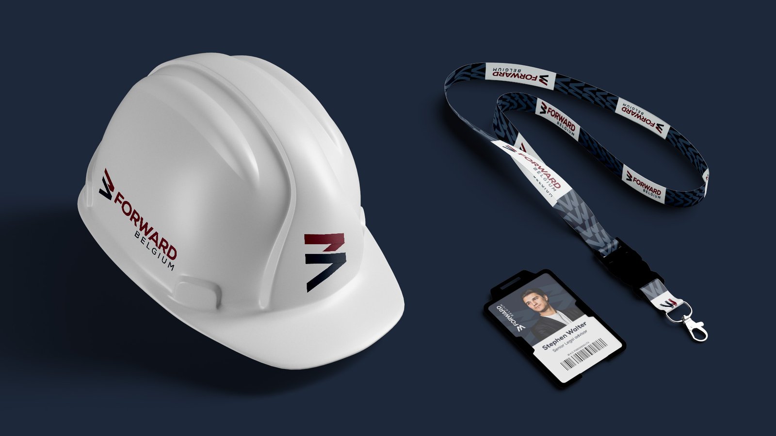
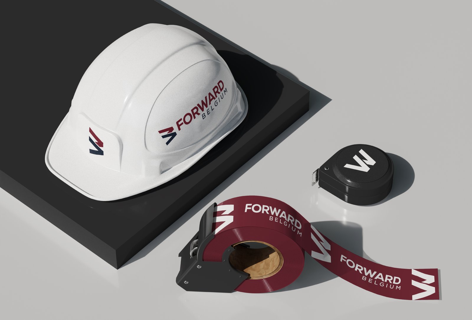
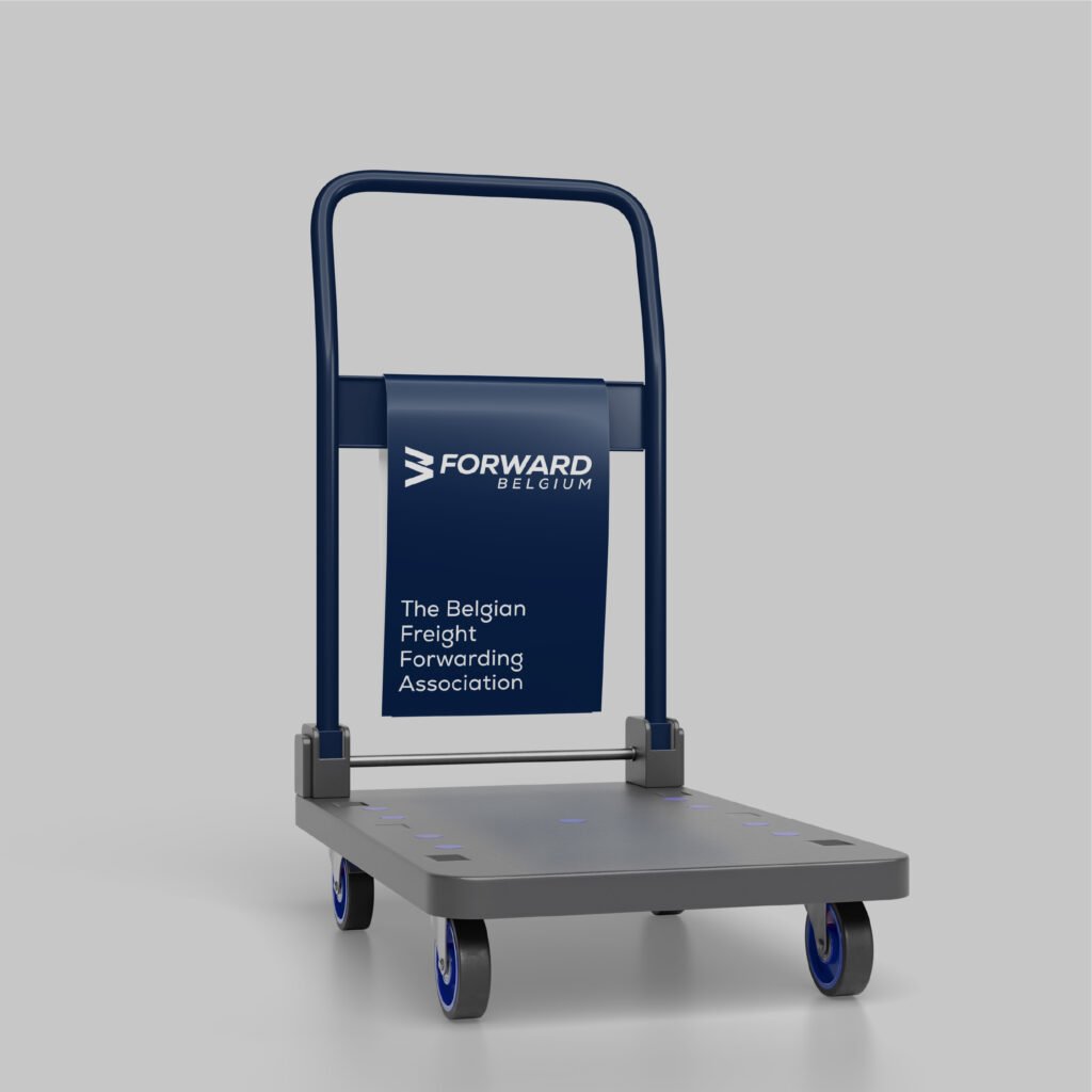
Logo Design, Brand Guidelines, Collaterals Design

Project Overview

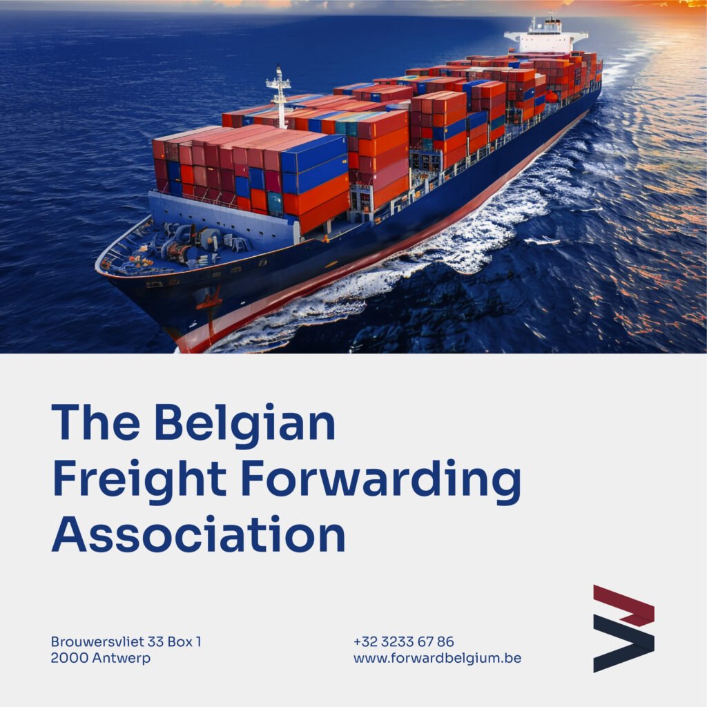
FORWARD Belgium is the national forwarding association that has represented the country’s freight forwarders and logistics providers for over 100 years. An institution with that much history needed an identity as dependable and forward looking as the industry it leads. I led the brand identity design from start to finish, distilling a century of heritage into one modern mark and building the full visual system around it, owning the creative direction end to end so the brand looked and felt consistent everywhere and gave every member a visual language to stand behind.

What I delivered:

  • A clear, confident logo
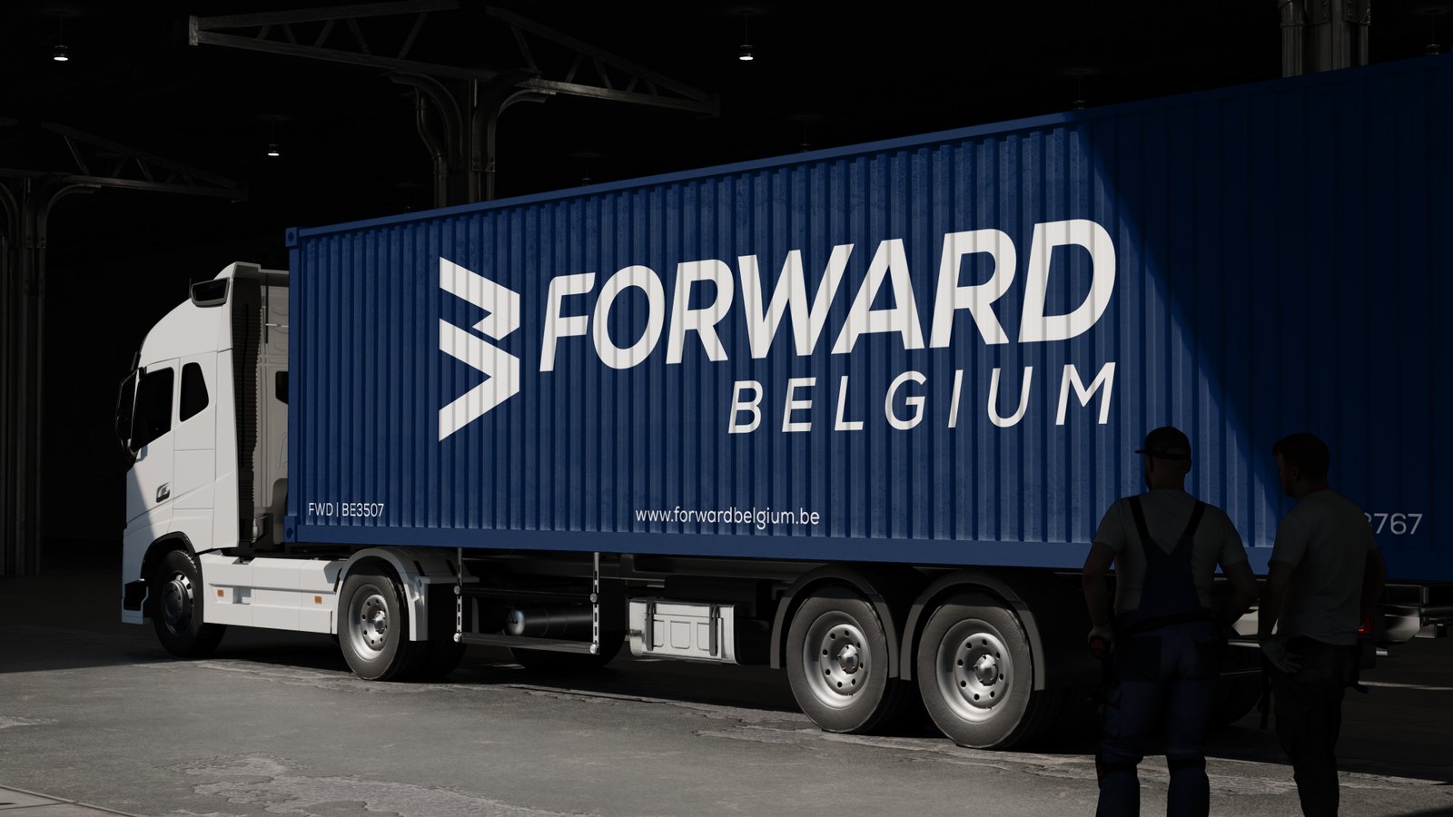
  • A cohesive visual identity system
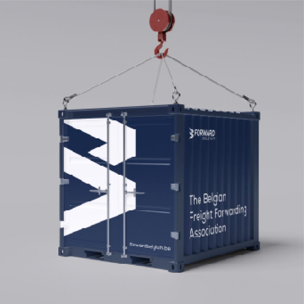
  • A visual language built around movement and direction
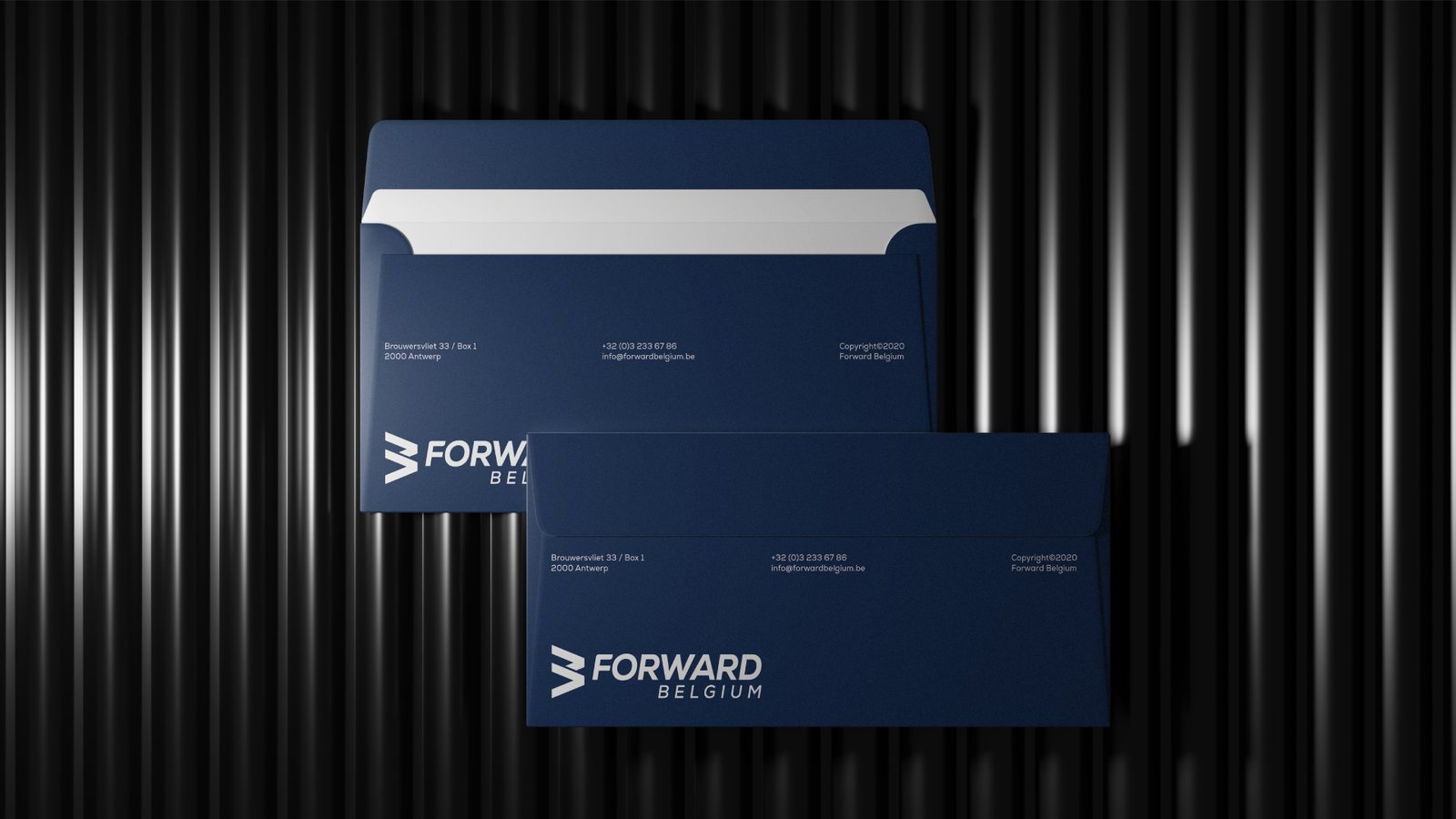
  • Assets ready for both digital and print

Challenge

The identity had to represent hundreds of members at once, from global freight giants to small customs brokers, without favoring any single one. It needed the authority of a century old institution and the energy of a sector that never stops moving. The key tensions:

  • Timeless heritage, yet clearly modern
  • One brand representing many members
  • Simple enough to remember, rich enough to mean something

Results

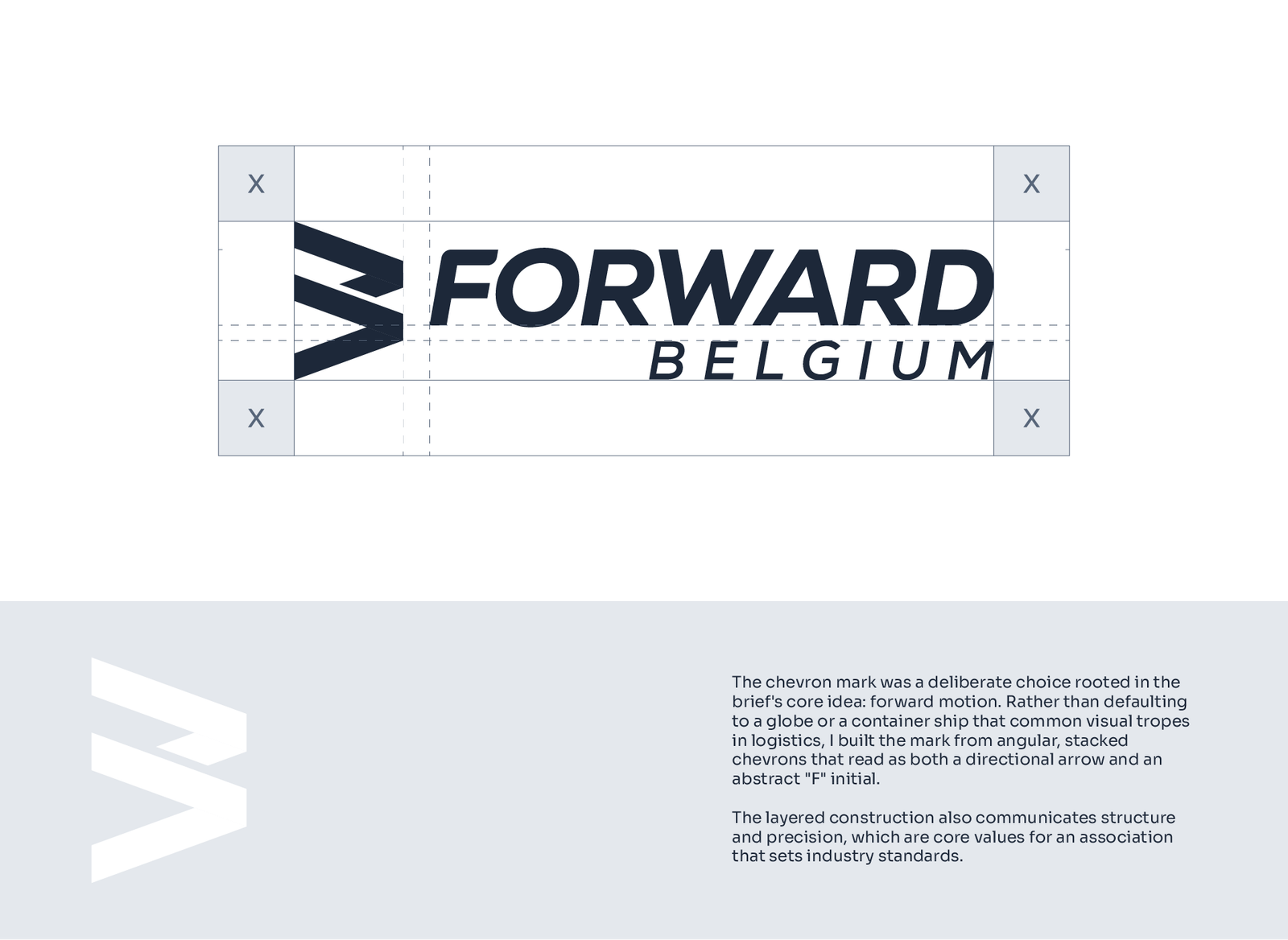
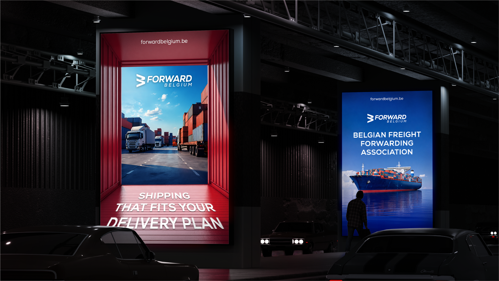
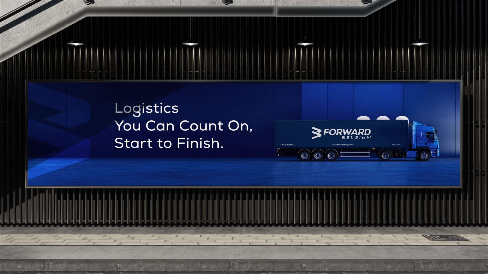
The result is an identity rooted in a single idea: forward motion. Every choice, from the mark to the layouts, leans ahead and signals reliability, the two qualities this industry is built on. It stays clean, confident, and instantly readable at any size. The system carries the weight of a hundred year legacy while looking ready for the next hundred. Simple, memorable, and always moving forward, it gives FORWARD Belgium a brand as steady and progressive as the association itself.

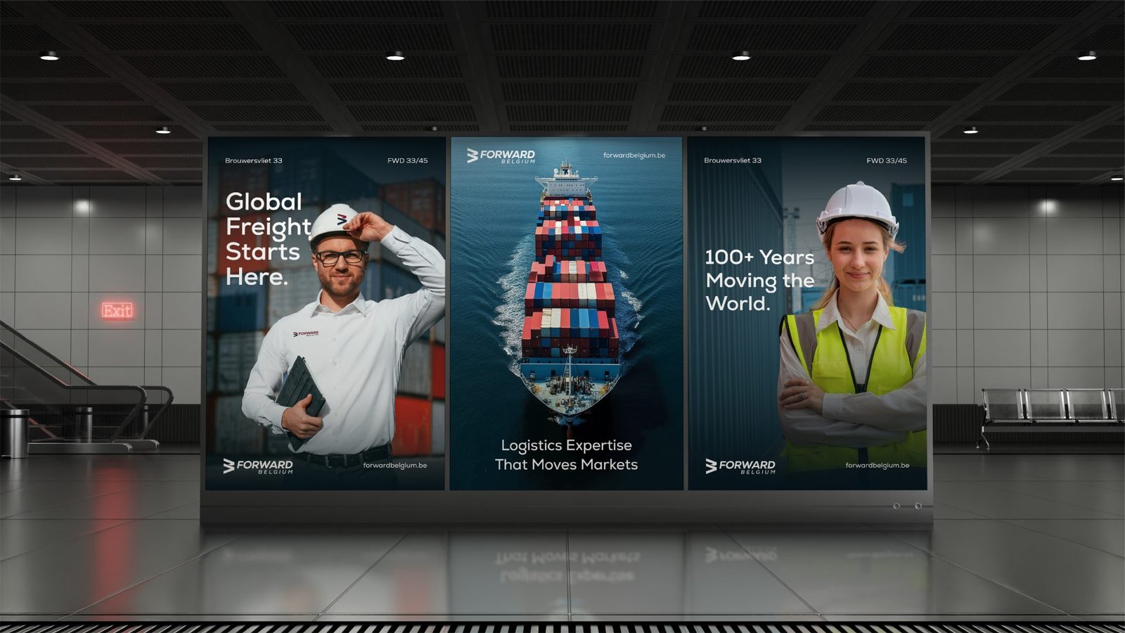
Image 3