Turning a boarding house run on spreadsheets and chat threads into one product people trust.
Project Overview
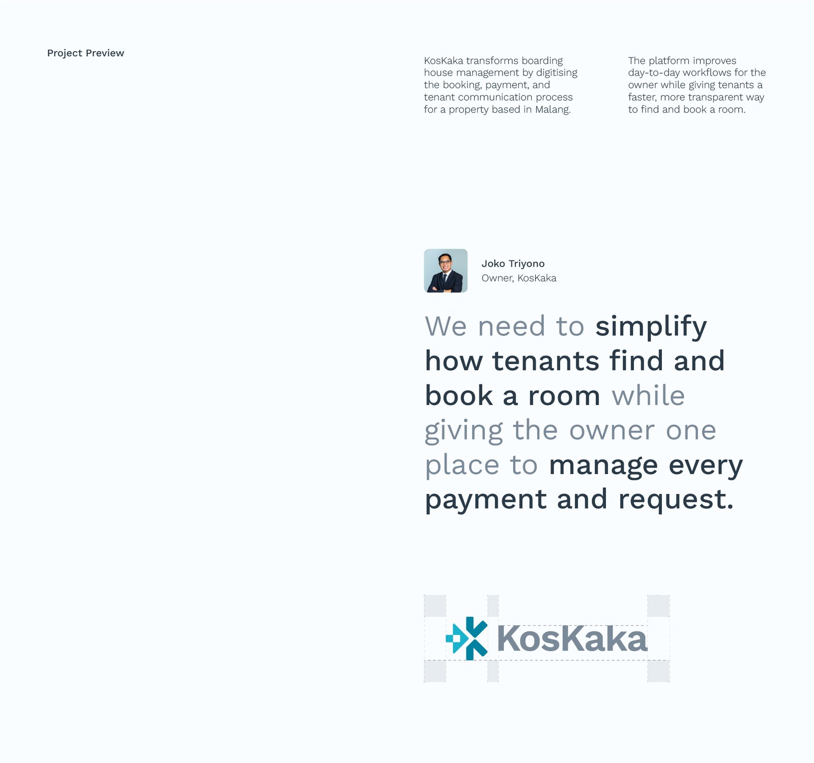
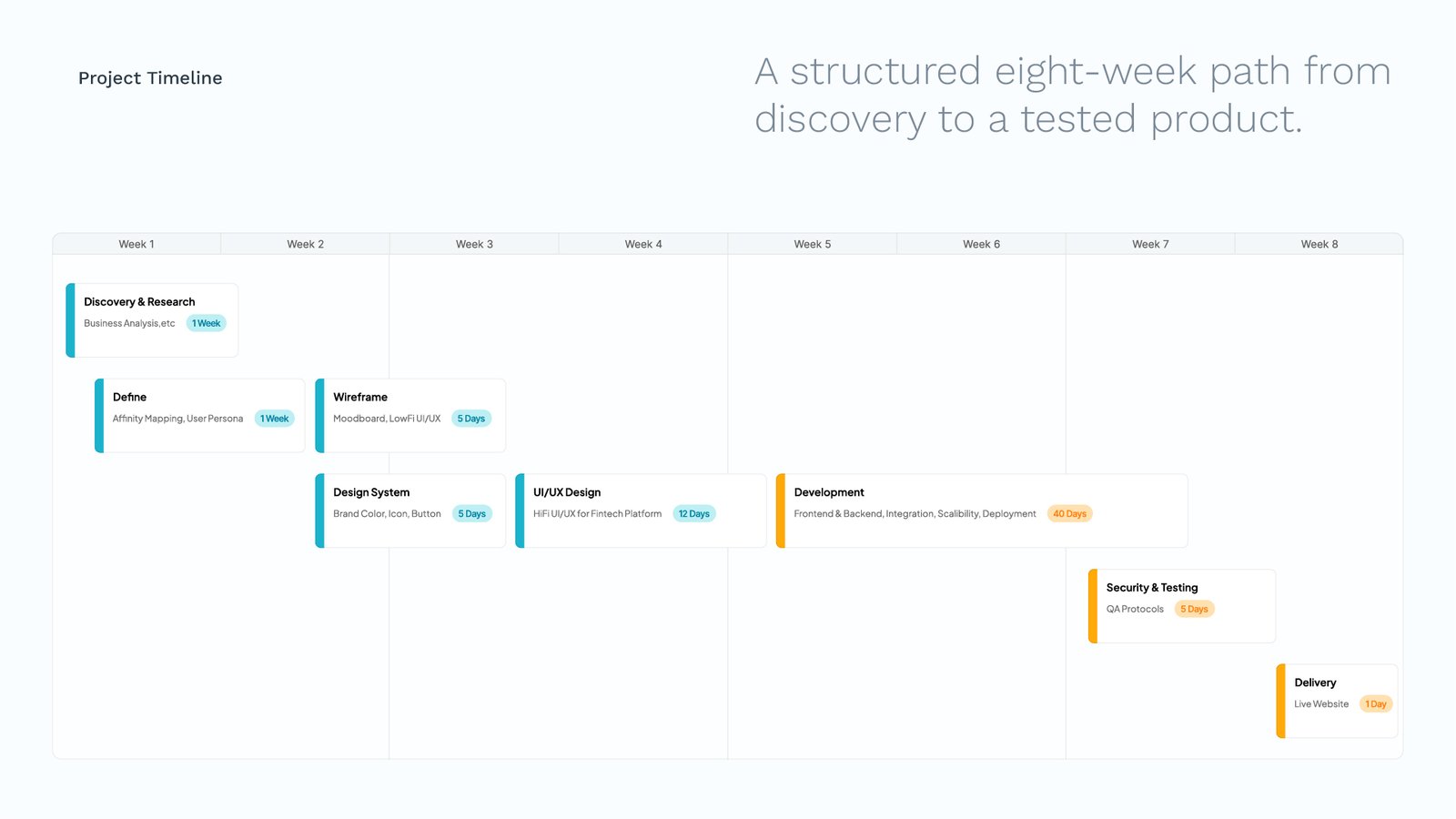
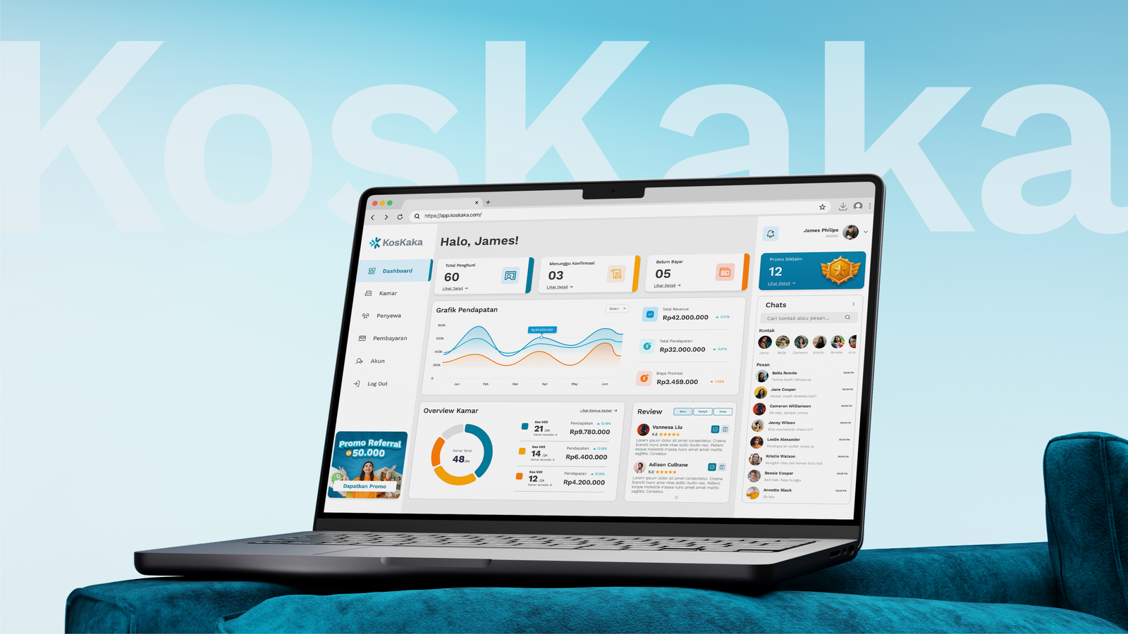
KosKaka digitises boarding house management for a property in Malang, bringing booking, payments, and tenant communication into one platform. It gives the owner a single place to run every room and every payment, and gives tenants a faster, more transparent way to find and book a room. I handled the brand and the product together, designing the logo and identity, then the full UI and UX across the desktop web app, the mobile app, and the landing page, across an eight week path from discovery and user personas to a tested product.
What I delivered:
- Logo design
- Brand guideline
- Design system
- UI/UX for desktop
- UI/UX for mobile
- Website Design
Challenge
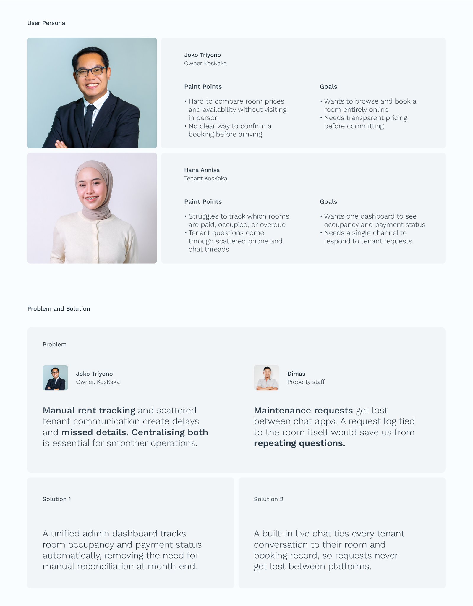
The owner was tracking rent by hand and answering tenants across scattered phone and chat threads, so payments slipped and requests went missing. Tenants had the opposite problem, no way to compare rooms or prices without visiting in person, and no way to confirm a booking before arriving. One product had to serve both sides at once, an operational dashboard for the owner and staff, and a calm, transparent booking experience for tenants, without either side feeling like an afterthought.
- One product, two very different users
- Dense operational data, still readable at a glance
- Software for people who are not thinking about software, they are thinking about where they will live
Results
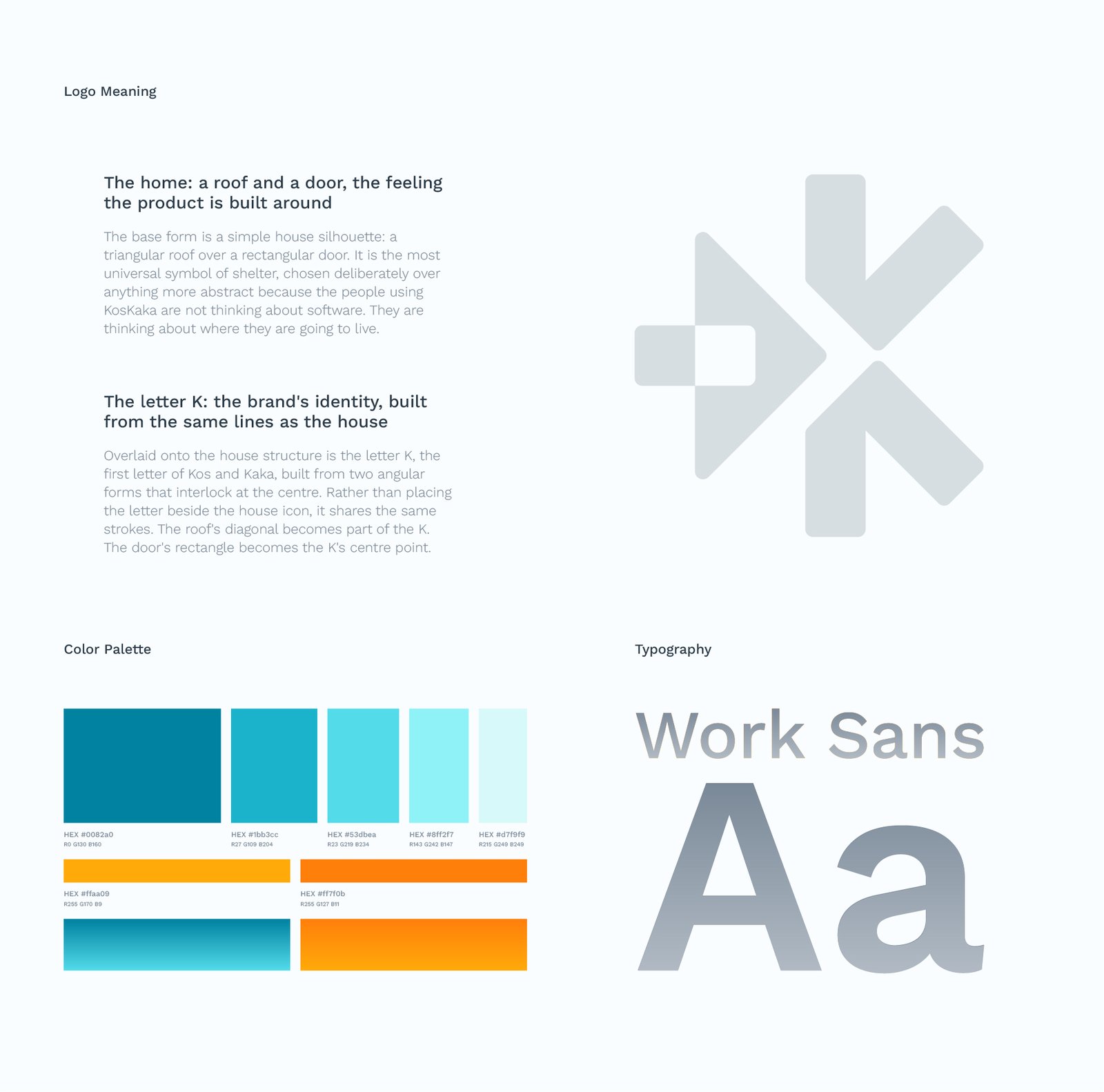
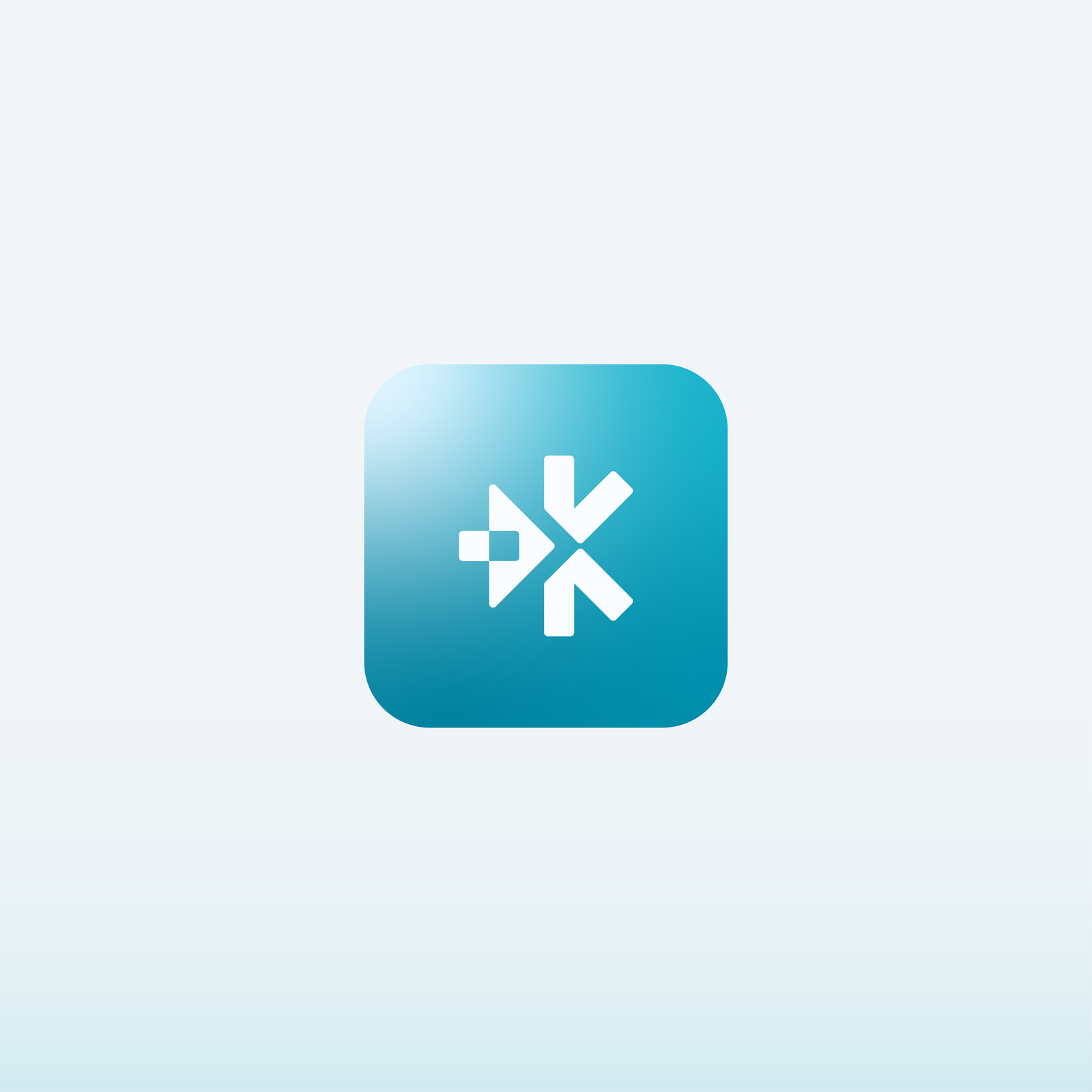
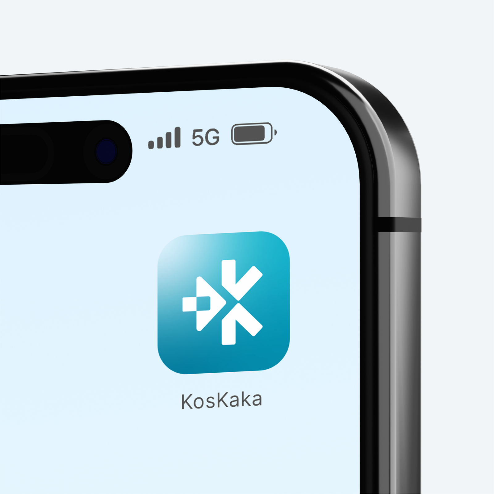
The identity starts with the most universal idea in the product: a home. The mark is a simple house, a triangular roof over a rectangular door, with the letter K of Kos and Kaka built from the same strokes. The roof’s diagonal becomes part of the K, the door’s rectangle becomes its centre point, so the brand’s name and its promise are one shape rather than an icon sitting beside a letter. A teal to cyan palette keeps the platform calm and trustworthy, warm amber and orange flag the things that need action, and Work Sans keeps dense figures legible at every size.
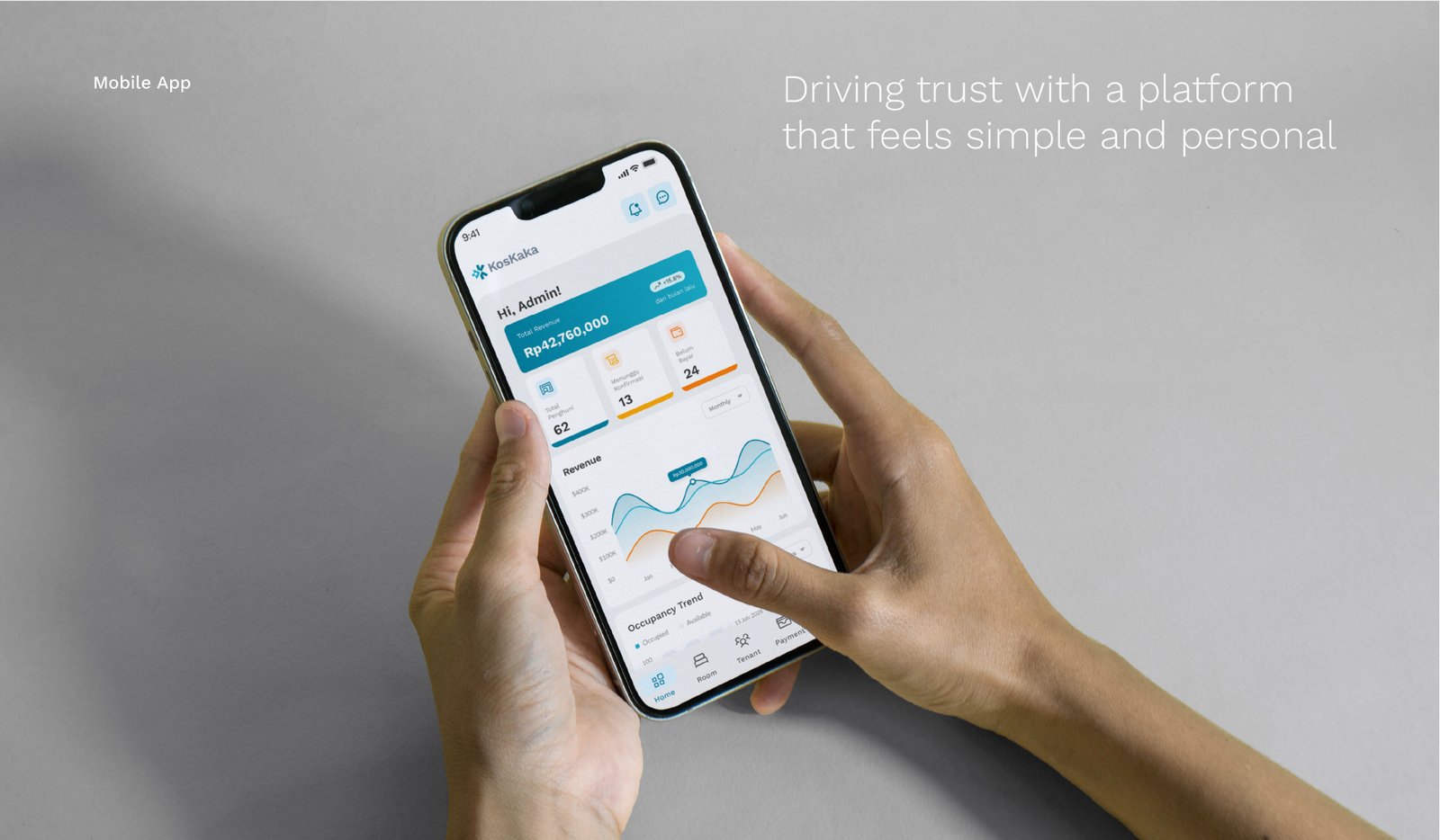
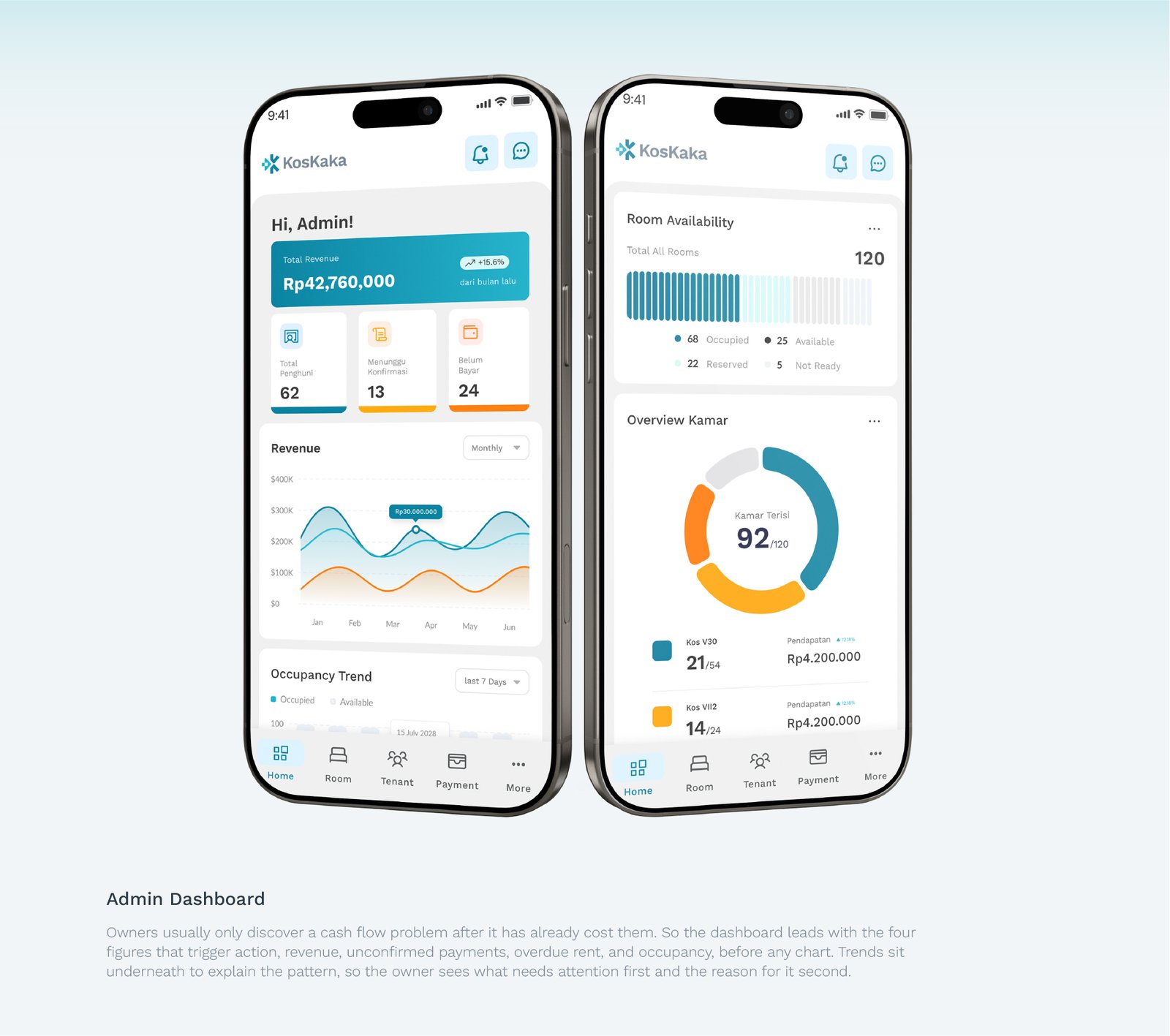
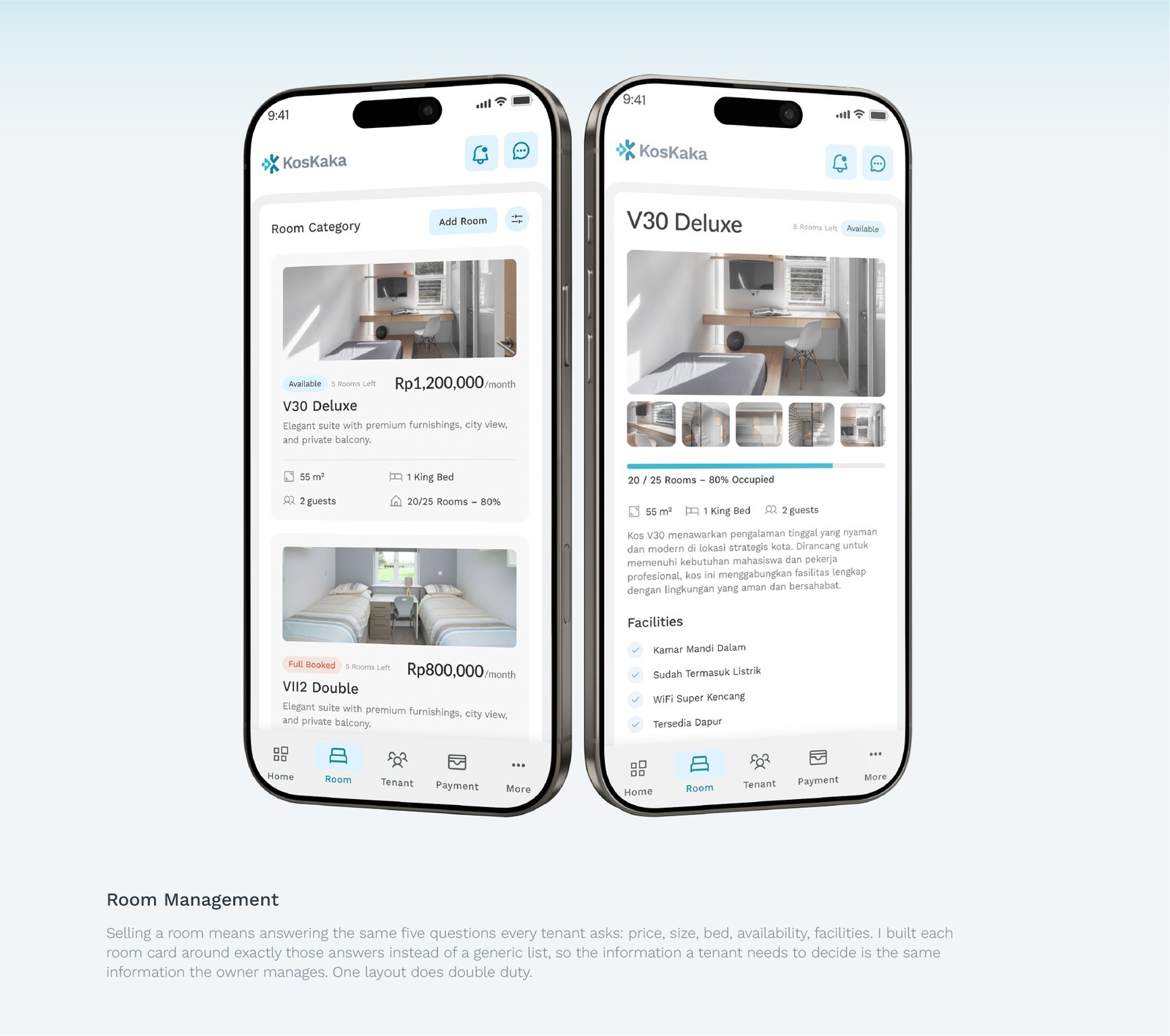
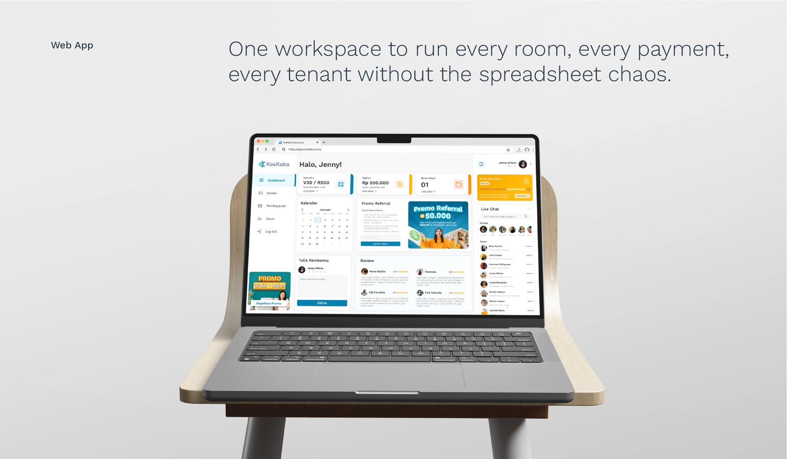
The product follows the same logic. On desktop the owner is working, not just checking in, so the dashboard sits priority figures next to live chat, since almost every task ends in replying to a tenant. Room management turns the full inventory into a scannable grid where price and category read instantly, and editing or promoting a room happens in place. On mobile the admin view leads with the four numbers that trigger action, revenue, unconfirmed payments, overdue rent, and occupancy, with trends underneath to explain the pattern.
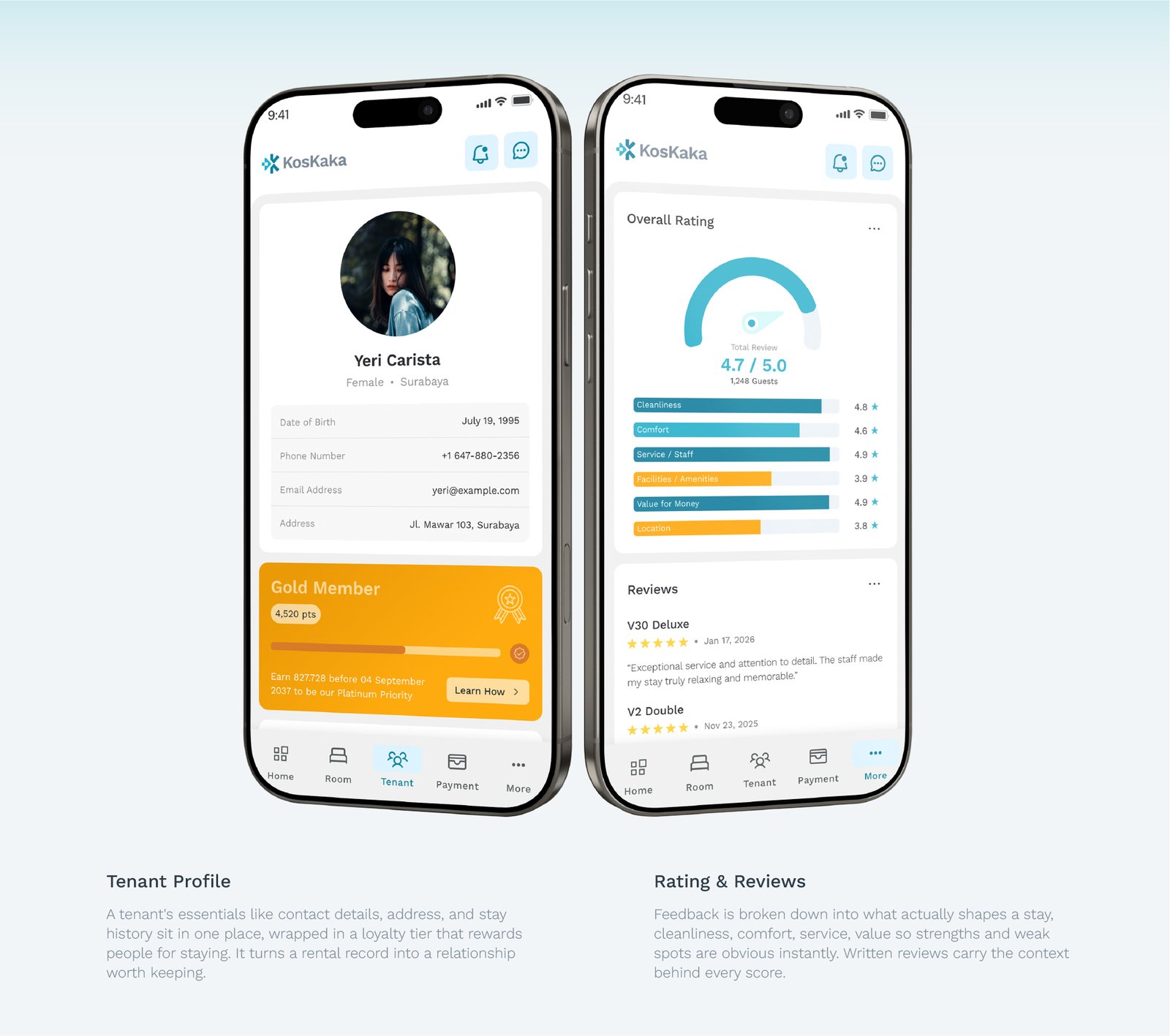
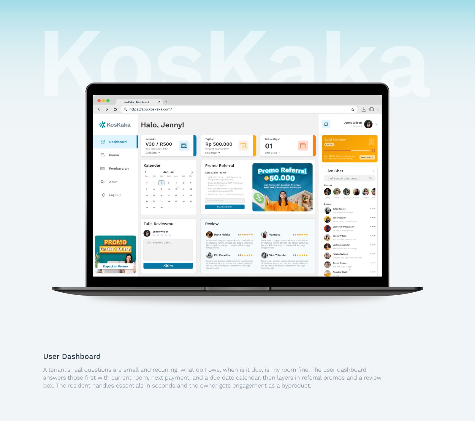
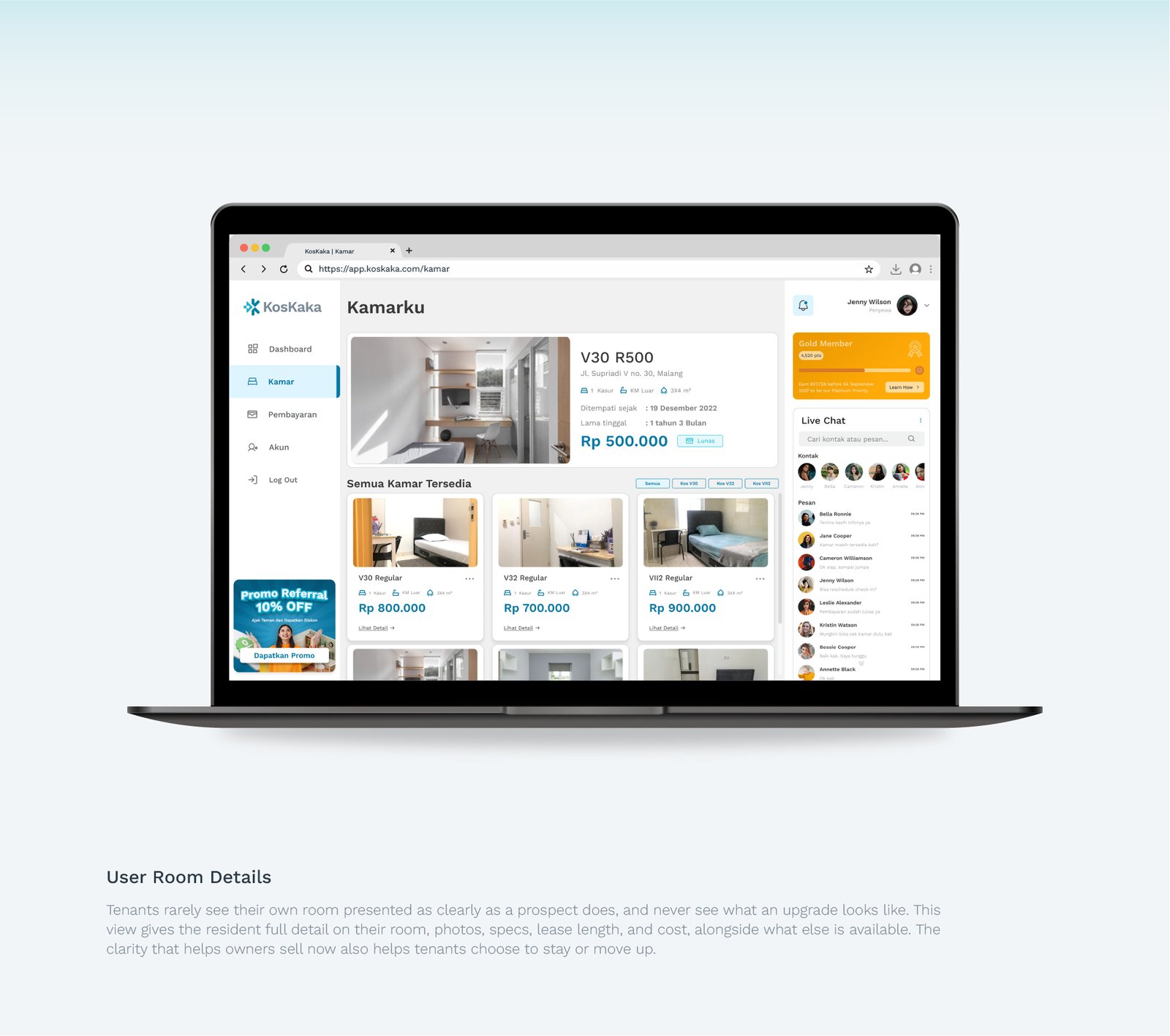
The tenant side answers the questions residents actually ask: what do I owe, when is it due, what does my room include, and what else is available. Room cards are built around the same five answers every tenant asks for, so one layout serves both selling and managing. Tenant profiles wrap contact and stay history in a loyalty tier, and reviews break feedback into cleanliness, comfort, service, and value.
The outcome is one system where brand and product say the same thing: a boarding house that finally runs like a real platform, and feels personal enough that tenants trust it before they ever see the room.